Thursday, October 16, 2014

And Me, And You, Android

Click here to see the 'And You' film from Android
The party’s not over ‘til the fat robot sings! Except, well, Android’s ubiquitous icon has been spotted doing just that – but according to the manufacturer, the party is only just beginning.

This week Android launched a new multimedia campaign focussed on revamping and repositioning their image. We noticed their new catchphrase, “be together. not the same.” calling to us from a bold double-page spread on the inside front cover of City AM this morning. Further investigation discovered it in the middle of Metro, splayed across the top of www.android.com, and stuck in a dozen other places around the web. 

Android is of course an open-source system, developed in private by Google until its periodic releases to the public. Other manufacturers can then pick up the platform and modify it to run on their own devices. Largely for this reason, Android dominates the smartphone OS market, with roughly ¾ of all smartphones sold using a variant of its code.

This latest campaign is designed to coincide with the release of Android’s new update, Android 5.0 or ‘Lollipop’.

It’s also timed to promote the announcement of two new Nexus products, the Nexus 6 smartphone and the Nexus 9 tablet. These bigger, more expensive versions of Google’s flagship mobile hardware (which of course run Android) aim to capture a larger slice of the top-end mobile market and its affluent consumers.

However, none of Android’s advertising makes any mention of either the update or the new devices. Instead, it focusses on the crowd-sourced and inclusive nature of the platform and all the people who use it, showing a quirky, cool image, complete with re-dressed robot icons.

Make your own android here!
Several different web ads are running and the new ‘Androidify’ app lets downloaders customize their own Android character and an initially dead link promoted during Walking Dead on Monday now points to Android’s homepage, tagged with ‘#betogethernotthesame’ and populated with new information on all Android works. The advertising successfully directs attention away from the hardware debate to the platform powering these pieces, and all the possibilities it contains.

So KISS your preconceptions goodbye, and keep an antennae out for more Android news. Hopefully it doesn’t get too robotic…

#PurePoint

Monday, October 13, 2014

The (Rowan) Atkinson's Diet


In January 1990, ITV introduced Mr Bean, "a child in a grown man's body".  24 years on the character devised by Rowan Atktinson is now the comic face of Snickers' latest phase of the "You're not you when you're hungry" campaign.


That's right, the sequel to 'Joan Collins "zip-it shrimpy" commercial features teddy loving Mr Bean. The most awkward man alive.


The series of ads, made by Daniel Kleinman, who directed six of the last seven James Bond title sequences, show a martial arts gang-member in various scenarios who isn't quite feeling himself due to his troublesome hunger (see video's below).


The ad series created by AMV BBDO marks a fourth year of using this marketing tag-line, following Mr. T's predecessing "get some nuts" promotional thrust.


We think the latest series is hilarious, and not only leaves us craving a Snickers but also a Mr. Bean marathon.

#PureAdOfTheWeek


http://www.yourenotyouwhenyourehungry.com/


Monday, October 06, 2014

Dirty Money

Metro Bank PLC, ‘the love your bank at last’ financial establishment that launched in 2010, kept their promise of ‘Surprise’ when Metro Dry Cleaners popped up in Farringdon (just down road from our humble abode).


When Metro Bank promised ‘unparalleled levels of Service and Convenience’ we honestly weren’t expecting them to do our laundry. But after a Poodle took over the front desk, who knows what they’re up to!


After a tumble of tweets to @Metro_Bank @MetroUK and @My_MetroBank the confusion was ironed out. Metro Drycleaners is in fact not related to Metro Bank. But who’s to blame us for thinking it was? The logo is undeniably similar!


Over summer Metro Drycleaners separated their colours from their black and whites, tailoring their branding away from Metro Bank.


However, just as we thought the money laundering had finished… we were highly amused to see a cash machine has now been fitted into the window. Oh the irony!


#MoneyLaundering      

#MetroBank    

#PurePoint    

Thursday, October 02, 2014

Brand Match-up

Sainsbury’s new CEO, Mike Coupe, described the current state of the supermarket industry as ‘a perfect storm’ yesterday. Turmoil exists with the traditional powers being threatened by brands such as Aldi, Lidl and Asda, who are seeing rapid growth. This has been exacerbated primarily by the high-profile troubles of Tesco, whose senior finance team is still in disarray and whose shares are the worst performer on the FTSE 100 this year.

The media has, of course, reflected this strife, led by Private Eye’s delightful satire of the ‘Every Little Helps’ ads; the core messaging of Tesco’s marketing strategy that helped them to become market leaders way back in 1995. This will undoubtedly have provided much mirth in the finance departments of their competitors. With the annual battleground of Chr*stmas (shhhh!!) fast approaching, open-season has been declared on Tesco (and indeed the other bigger names in the sector).

A prime example of this is the media feeding frenzy in this morning’s Metro. This is one of the finest collections of reactive ads that we’ve seen – certainly since the Royal birth last year.


It starts with Lidl, who (once you get past a somewhat baffling ad for a hydraulic jack on page 5), has a pop at Sainsbury’s, who are still reeling from the fallout of Postergate where a staff member inadvertently put a staff room poster on public display…

Lidl later continue with their push for an increased share of wealthier customers by promoting their Wine Cellar with the examples at a healthy price point (£8.99 - £16.99). 


Sainsbury’s, who appear with a full page ad on page 10, has chosen to completely disregard Tesco as a traditional competitor and instead turn their focus – and they hope, their customers’ focus - onto price comparison with Asda.  

Asda, in turn, has peppered the paper by taking space on four separate spreads, with four different ad formats. The most impressive of these is the sublimely timed full page ad on page 23, which confirms their price-point as a key USP and hints that Sainsbury’s are a little late to the game.


Morrisons has an unremarkable ad in an unremarkable place, while Tesco, inevitably trying to keep a low profile, yet needing to show its face at the party, has shuffled in quietly with a non-contentious, almost anonymous looking ad hidden away deep in the middle of the book.

So, who are our winners in all this jostling? 

Well, Sainsbury's has put itself firmly on a path to demonstrating value, while Lidl and Asda have both taken very effective swipes at them with some great quick reaction creative. 


All three have failed to recognise Tesco as even being a competitor, which is perhaps far more damning. 


#PurePoint

Friday, September 26, 2014

The Spread of Zombies


One thing every commuter has in common is the expectation of seeing a few thousand suited zombies in the morning. Let’s face it, between Ate O’clock and 9 O’clock in the morning, the walking dead take over London. Of corpse we all know it’s not the apocalypse, it’s just a bad case of commuter amnesia. As we all board the London underground, groaning, scrambling and staring into space on our usual route to work.

Bored to death we all fall soullessly into routine: checking our phones, flicking through twitter feeds; amusing ourselves watching fellow commuters dive for the train… and sharing that moment when you make eye contact with the complete stranger you've found yourself contorted against (not quite as romantic as match.com makes out).


Yet yesterday morning we found our personal space invaded by Sky’s Walking Dead advert in the Metro. The placement couldn't have been more dead on. With Halloween lurching ever closer, Sky’s timing is exemplary. By taking the first double spread, they've really broken through the usual menagerie of ads that capture and possess the Metro’s early pages. We think Sky’s double page spread truly paid off and are sure many Londoners are going to be feasting on a few Sky Box Sets this Autumn.

#PureAdOfTheWeek


Thursday, September 25, 2014

H20-dear!

The Ryder Cup is one of the most prestigious events in world sport. With a wealth of heritage attached to it, the competition offers brands a fantastic opportunity to exhibit themselves to and associate with a captive and passionate international audience,.


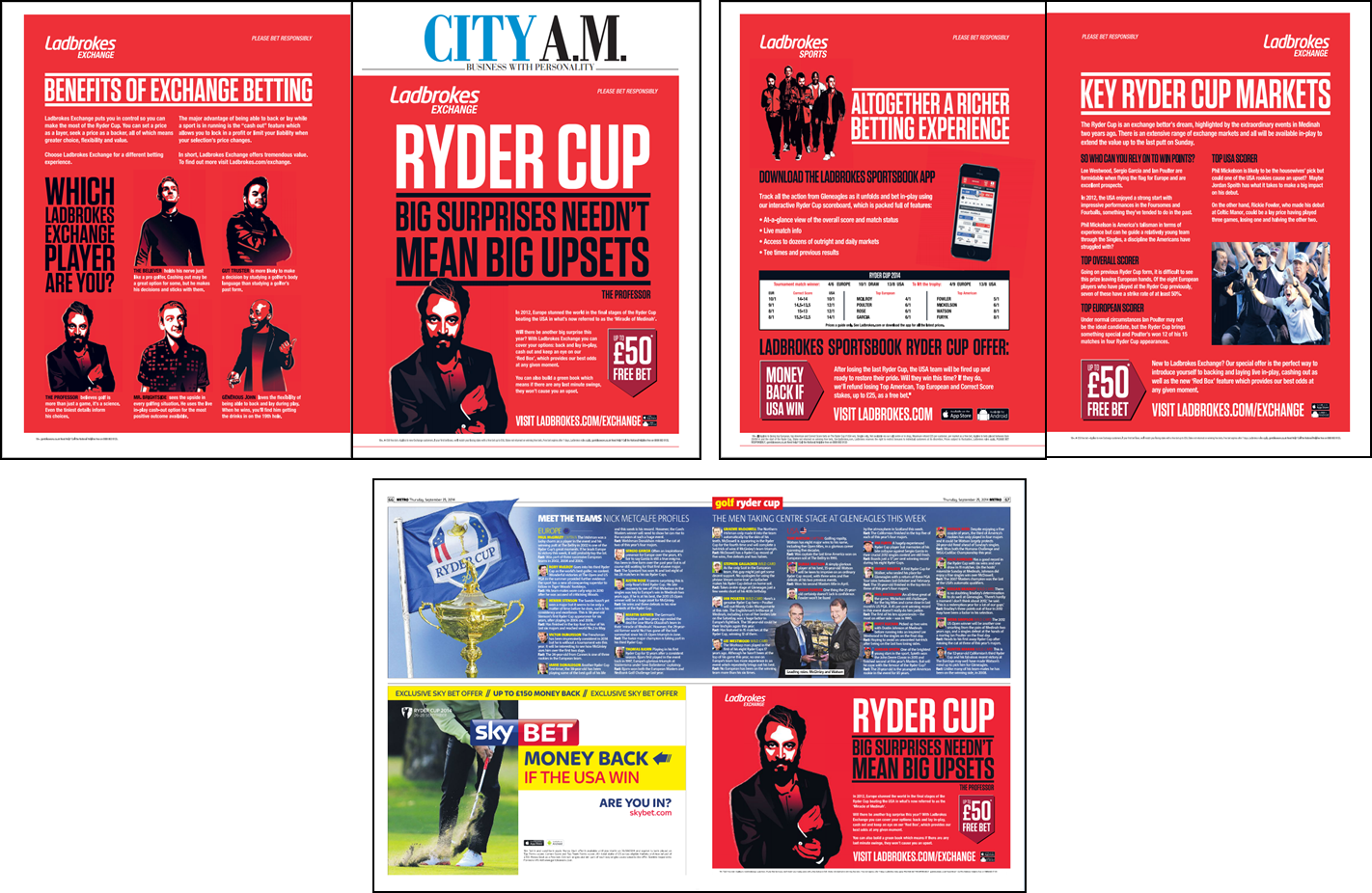
The latest biennial instalment tees off tomorrow at Gleneagles in Perthshire and Ladbrokes’ cover wrap of City AM this morning (as well as a neatly placed half page in the Metro) is a perfect example of how relevant advertisers are looking to create a splash and draw attention in a crowded marketplace. Certainly eye-catching!


The alternative route to spot and space is the brand association created through sponsorship or supplier agreements. Among the list of the good and the great who are ‘Official Suppliers’ to this year’s inter-continental contest are Highland Spring, who are proud to point out that they are based only two miles down the road from Gleneagles.

Unfortunately, their branding as ‘Official Bottled Water Supplier’ on the bottles fails to have any standout whatsoever. Even moving the stamp a few millimetres up the label would create contrast between mauve and white, but instead it is washed out…which sadly dilutes the impact significantly.

For something so significant to Highland Spring – both geographically and of course, financially – it is a real shame that their co-branding is watered down to this extent. 

#PurePoint

Friday, September 19, 2014

MADE for the Occasion


Thunder wasn’t the only thing keeping us awake in London last night. 

As the votes were counted, we were kept in suspense; would Scotland break their 307-year-old union with England? At Pure, we were all wondering how this would affect marketing campaigns: so, much to our delight MADE.COM took a comical spin on the referendum first thing this morning.

Ensconced on the 8.03 bus towards Waterloo, I was lulled into the monotony of my conventional commute; you know, sat next to the token guy who forgot to wash, behind the girl doing her make-up. 

Having not yet checked the results of the Scottish referendum, I received the following email from MADE.COM, titled “NEWS: MADE.COM opens in Scotland”.

Sure enough I was compelled to open it – I mean, who needs a call-to-action headline when you've just dropped the S-Bomb?

The email contained a £10 off code 'AUCHAYE', a casual mention of their recent launch in the Netherlands, and some 'patriotic inspiration', in the form of blue, Saltire-themed products.

…”Oops! Please ignore our last email.‏” 

Within seconds I received a second email, filled with Union Jack emblazoned products, pretending to have 'accidentally hit send' on an email they had prepared for the ‘YES’ vote.

With the eyes and ears of Britain eagerly awaiting the results, MADE.COM truly optimized their marketing - both message and timing - and took the opportunity to intrigue, engage and amuse their customers, while celebrating the Union with a £10 off code titled, 'GREATBRITAIN'.


#PurePoint

Monday, September 15, 2014

ROOOOOAAAARRRSOME Bus ads!!


We’ve posted previously about some impressive bus advertising but the latest offering from Sky has to be deemed a roaring success.


Utilising an innovative mega “T-Rex” T-Side, Sky has created a highly impactful ad that achieves fantastic stand-out and cuts through the traffic in a crowded marketplace.
Bus advertising offers excellent opportunities for street level advertising targeting urban shoppers and commuters across towns and cities where other outdoor formats are few and far between.


The eye-catching effect of these Roarsome ads makes some of the competitors look distinctly pre-historic, while ensuring that the message is remembered with fun and catchy creative.
#PurePoint

Wednesday, September 10, 2014

Creatively compromised ?!?


Whilst we are all for media creativity and generating IMPACT and STAND OUT in conventional, traditional newsprint environments - we can't help but feel that the Metro has somewhat overdone it today and 'sold out' on the less conventional creative formats they offer.


On pages 26/27, Halifax has made the most of running CHECKERBOARD placements across the spread to deliver multiple messages and amplify their EXTRA proposition.

Turn the page and we see that Ryanair has adopted the break-out creative ZIG-ZAG format. Rather than being impactful, this actually appears overly busy and - confusingly - almost an extension of the Halifax EXTRA ads due to colour similarities and as a result of running these formats consecutively...


As if that wasn't enough, turn the page again and another ZIG-ZAG format is running across the spread on pages 30/31.


Usually, we would deem this to be a highly effective use of space, demonstrating media and creative teams working in synergy to deliver the Relish ad within newsprint. Instead, with today's spreads the concurrent 'unconventional' media formats have far less impact - and frankly look conventional!

This has resulted in a sequence of busy spreads, with a mish-mash of editorial squeezed in throughout. 

It seems as though Metro has lived up to its front page headline and forced the advertisers into a constricted space; no Extra value and hardly something to Relish!  

#PurePoint

Wednesday, September 03, 2014

Satnam Mudhar; My Summer Internship at Pure Media

Words cannot describe how appreciative I am of each person in the Pure team who spent their own time to teach me their knowledge and understanding in planning and buying.  In a tough employment market I could not believe I was given such a great opportunity to learn.

Whilst being a full-time student at university my perception of the media industry was very theoretical and perhaps also quite narrow. I was certain that my degree would lead me into a career in communications, PR or journalism. I hadn’t even considered a career as a planner and buyer of media – probably because I didn’t even know it existed!

When I first started my internship in June I was under the impression that I would be handed a junior role – one that would involve me conducting the stereotypical work experience responsibilities… i.e. photocopying and making coffee.

Instead I was thrown straight into the deep end! As I started to carry out a wide range of tasks, I began to see the level of commitment and responsibility needed when engaging in a multi-dimensional and volatile media industry.

I began to learn about the different aspects of advertising in media including the fundamental differences between press, TV, radio and online media; understanding how each affects a target audience.

I was trained to use specific tools and software essential to media planning and buying and had exposure to various theories of marketing. Nielsen, Mediatel and Google Analytics are just a fraction of the tools I used when conducting my work experience. Although I was aware of the basics I became increasingly competent at using Microsoft tools such as Excel.

Working with a talented, hard working media team in the agency enabled me to build on my team working skills. I was lucky enough to have been given the responsibility of talking to external contacts and furthermore learnt to practice a range of communication skills needed when researching and making media plans for our clients.

I was also given the privilege of participating in some of Pure’s social media activities such as the #PureQuoteOfTheDay on the Twitter and LinkedIn as well as other social media scheduling.

My time with Pure has been a extremely enjoyable one and I am highly grateful to the team for this opportunity. As I embark on going back into my into my final year of university I aim to take these skills I have learnt and develop myself into a fully fledged media professional.


And who knows, the association between Pure and I could be one to be continued…..


Monday, September 01, 2014

The Gruffalo Continues to Crumble

You might have seen our post back in April, remarking the 81 day old ad as ‘past its sell by date’. Well 232 days later, it’s still there, hanging on by its turned out toes, like a wart stuck on the rear of the London bus.


The Gruffalo is promoted as being ‘Live in the West End’ at the Lyric Theatre until 12th Jan.


It’s about time little mouse piped up and inhaled this crumbling OOH ad.

Friday, August 29, 2014

Simply a Skinful Effort

Well-known skincare brand Simple recently launched its ‘Kind to City Skin’ campaign, with the aim of educating consumers about the detrimental effects urban living can have on our skin.


It’s an interesting push for the brand, eschewing the usual skin-type-based advertising in favour of products tailored to lifestyle. Based on the amount of on- and off-line discussion generated, the campaign has so far been performing well.

Simple has set up an ‘Advisory Board’ on their website, consisting of dermatologists, nutritionists and psychiatrists, and is shedding articles providing skin-care advice. This is combined with considerable paid-for media presence on TV and in print, as well as various outdoor formats, with ads and content videos also running on social media.

The campaign has been targeted geographically, with a presence at core high footfall commuter hot-spots, running in free-sheets and across multi-format key placement outdoor sites. It highlights the skin detriments which can result from daily commuting – or, as Simple call it, ‘commuter skin’. With an estimated cool £7m laid down for this campaign, this appears to be a well-rounded strategy, thoroughly considered from all angles. 


Which makes it simply confusing to see that, having chosen to take over the huge 40x3m digital motion site at Waterloo Station, Simple have then decided to run with 4 consecutive copies of the same ad.


Given the size and advertising power of this giant digital surface – and the 17-minute average dwell time of its captive audiences – it seems a real waste to feature 4 repeated consecutive creatives. There is so much that can be done here!


This is even more a pity given generic content of these particular ads in the first place. The irony of using a highly-polished digital surface to advertise a ‘city skin’ campaign could have been used to great effect here, but it appears lost to the advertisers. Lazy, Simple, lazy!

Or was it, perhaps, a touch… over-Simplified?

#PurePoint

Friday, August 22, 2014

A Special Thanks!

…From Pure Media to everybody who joined us last night for our first annual #PureRoofParty.

It was great to see you all for a catch-up, laughs, booze, and (attempts at) dancing.


Same again next year!


#PureRoofParty

Monday, August 11, 2014

Adidas goes 'all in'

A fully liveried bus ad is an impressive piece of outdoor marketing that will usually receive a fair amount of attention due to the sheer impact of the format. The reach opportunities are increased by the obvious mobility and also the ability to access retail areas where there are little or no other OOH formats available.

As with most media, it is especially effective when tied into events, such as the recent ‘All in or Nothing’ message from adidas which was timed to maximise their presence along the routes of the no.38 and no.8 buses during the World Cup.

These fully wrapped buses are high cost in terms of production which encourages longer campaigns to maximise value for money and lower media costs pro rata. There is the risk, however, that the message soon becomes stale and the impact diminished.


The latest Adidas activity is for their new Predator boots, timed perfectly to coincide with the start of the upcoming season. It’s both refreshing and intriguing to see a brand follow up on successful bus branding rather than using it as a ‘one-off’ impact piece. This willingness to spend big on the on further production augments the Adidas brand stature, especially given the assumed association with the cutting-edge Routemaster buses.

It’s good to see the use of the large format hashtag. It’s being used to pinpoint a particular product (and potentially help measure response) rather than being used for the sake of it.

Adidas has definitely kicked on and let their #predatorinstinct take over, giving them familiarity in the space and the potential to score a victory over rivals in owning the medium within London.

#PurePoint

Wednesday, August 06, 2014

A short of Johnnie Walker Blue Label hits the spot

The iconic scotch producer has charmed us with a stylish, sophisticated and extremely cool short film directed by Jake Scott and starring Jude Law and Giancarlo Giannini.

 The Gentleman's Wager
The Gentleman's Wager ft. Jude Law and Giancarlo Giannini
The suave 6 ½ minute short depicts two evidently wealthy gentlemen in a wager for something money can’t buy. The 30 second teaser has helped to drive more than 3 million views of the full version in just over a week.

With product placement as effortless as the sheer style of the actors, we are truly immersed in the Johnnie Walker lifestyle – prompting frivolous, sun-kissed daydreams of winning a boat in exchange for a dance...

The marketing spiel is that the ad reflects the progressive and developmental nature of the Johnnie Walker brand.


Some have suggested that it’s impressive as a brand piece, but that the lack of ‘depth’ to the story and the frankly rudimentary dance that Law ends up performing (especially when compared to this mesmeric Christopher Walken effort) means the inevitably huge price-tag attached is brought into focus...which in turn might lead to weighing up the cost of a branding piece like this against its true value. 


Undoubtedly, however, their luxury marketing strategy definitely engages gentlemen aspiring to be Jude and the many thousands of women who wish they were dating Mr Law, while also leaving the scenario open to the possibility of a sequel.

Either way, we’ll happily raise a hump day glass to this most enjoyable and classy effort.

#PureAdOfTheWeek

Friday, August 01, 2014

Great Western Super Bear...

Great Western has had a bit of a nightmare...

The presence of Hiscox has "insured" that the Great Western outdoor campaign, featuring stunning imagery and located perfectly outside Paddington station, is somewhat...well...stuffed! 


In what can only be described as a bit of an oversight, GW has failed to secure 100% share of voice and dominate the entire row of 48 sheet poster sites, with the Hiscox ad proving more disruptive than leaves on the line.


Another question: why would you not make sure that you took all the available sites? There's one 48 sheet sitting totally free at the end of the row, looking fairly unloved - like Paddington Bear..!


What could have been a contender for the coveted #PureAdOfTheWeek has become a disappointing example of an 'almost' campaign. #PurePoint